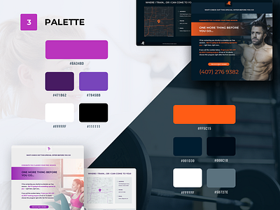
Fitnes Trainer Palette
Glad to introduce the project I've been working for a while ago. Now I’m glad to introduce you some results made for this project
Here is a palette of primary colors used in this project. All other colors are a combination of main colors with various opacity. The important thing about palette is flexability to work for white and dark theme at the same time as well as cover two primary accent directions.
If you want to have a look at the full showcase of this project — you are welcome to visit Behance presentation.
Hope you like how it looks and feels.
As always, if you have any ideas, comments or thoughts about it — you are welcome to discuss them with you.
More by Roman Bova View profile
Like
