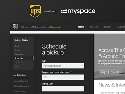
UPS Redesign
An internal design exercise @Handsome. We had to study, reconstruct and reapply the visual aesthetics of one site to another. The two sites I chose to use for this redesign were UPS and Myspace. I merged the layouts of both sites and tried to stay true to the overall feel and look of Myspace, while at the same time taking into consideration the working functionality and use of UPS. Be sure to view the attachments for a better look!
More by Termini Design View profile
Like


