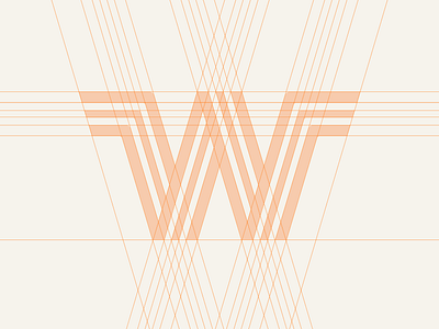
Whataburger Logo Redesign (Unused Mark)
Here's on of my entries for the logobuffet challenge. I decided to redesign the Whataburger logo. At first, I only wanted to fi the visual imbalance, but as I deconstructed the lettermark, I noticed a lot of inconsistencies in it.
In this redesign, I simplified the logo and made the lines feel more visually balanced. I also flattened the edges to make it more approachable.
If you want to see more one this logo redesign, check out my instagram! https://www.instagram.com/p/CAu6ohHATSO/
More by Patricia Roxas Chua View profile
Like
