Big Sur Figma
What do you think about the Mac OS Big Sur aesthetic?
—
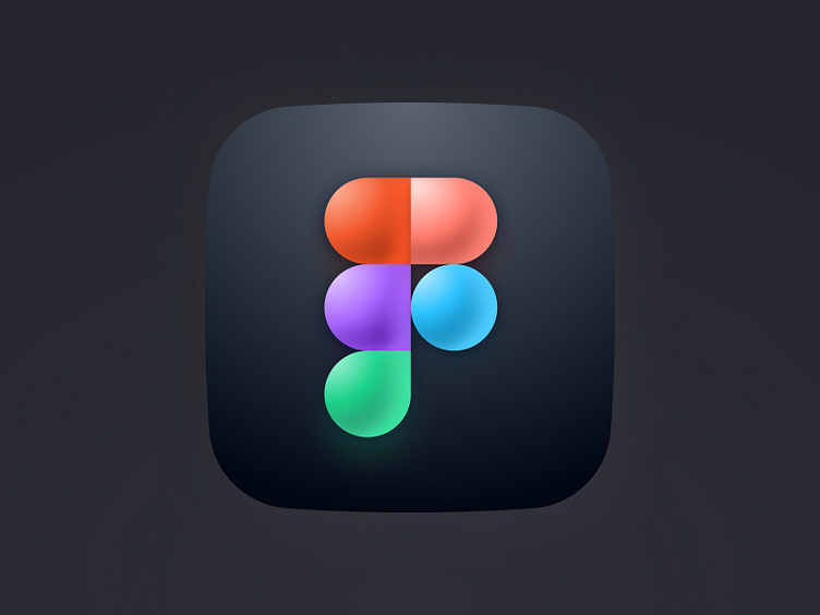
Figma Logo in Mac OS Big Sur style… using Figma 😅
Guys, it is dark and cold down here. I am referring to the massive rabbit hole I’ve gotten myself into trying to recreate the Big Sur icon style. Skewmorphic? Neumorphic? 3D? It is safe to assume that we will be seeing a lot more of this visual language informing apps we use every day and I, for one, am not super excited about it. While it is cool to see companies taking steps like these (I remember the huge impact Microsoft had with Metro back in the day when everyone was trying to be hyper-realistic), I am not as enthusiastic at this since I see it as purely superficial rather than trying to achieve a purpose. For context, previous shifts were meant to consider external factors, like embellishments to simulate realism and inform function, better use of real estate in screen sizes, etc. This time around, it feels like this style is purely to show off screen resolution? Not sure.
Share your thoughts in the comments below!