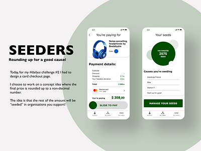
Checkout for a good cause!
Today, for my #dailyui challenge #2 I had to design a card checkout page.
I choose to work on a concept idea where the final price is rounded up to a non-decimal number.
The idea is that the rest of the amount will be “seeded” in organisations you support!
Let me know your thoughts in the comments!
Some more context:
I decided to participate in the 100 days UI challenge with two objectives:
1- improve my UI
2- Advocate & promote accessibility & designing for a good cause & better world!
You can read my latest article on medium about the good practices on UX accessibility right here :
https://uxdesign.cc/how-to-design-digital-interfaces-with-every-disabilities-in-mind-19572579d7ef
Cheers!
More by Maurice Wehbe View profile
Like
