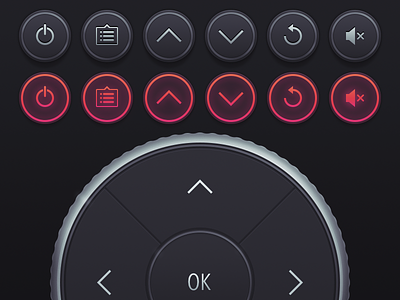
Control for iOS interface
Here’s some of the UI for Control — each person has their own layout, built from the same set of components. Given that the app is likely to be used inside and at night, we thought a dark UI would be best. And given that it’s only for us, we thought we’d go for some old school realism. Rocking it like it’s 2008! Ah-yeah!
More by Marc Edwards ✎ Bjango View profile
Like

