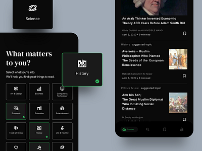
Heuristic Rule 02 - Medium Apps
Hi Designer Folks! Continue to share my knowledge about UI design guideline from Nielsen and Molich’s 10 general principles for interaction design.
Heuristics Rule Number 2
“Match between system and the real world”
--------------------------------------------------
The system should speak the users’ language, with words, phrases, and concepts familiar to the user, rather than system-oriented terms. Follow real-world conventions, making information appear in a natural and logical order.
All highlighted interfaces on this post is how this rule is implemented in interface design.
When conducting a Heuristic Evaluation on interface design that is intended to find usability problems at heuristic point 2, Match between system and the real world.
I usually make a question like the following:
1. Are UI elements and interactions easily recognized?
2. Does the online experience replicate the familiarity of offline actions and behavior?
3. Does the product use acronyms, technical terms, or jargon that needs explanation? If acronyms are used, are they read clearly?
Feel free for leaving your comments, constructive feedback is welcome. 🙏
Don't forget to share some ♥️ with this design
uxmarker was founded with one mission mind: creating the best and most reliable user-centered design for our clients. Here in our HQ, we deal with a wide range of design avenues on every product platform. To ensure a satisfying product experience, our dedicated team generate data from curated user research methods and analyse them to find and fix various design obstacles. With our ingenious ideas and tested skill, we believe we can help make your products a pleasure to workwith.
We are available for projects, hit us up at hello@uxmarker.com
Instagram || Medium || Shop at UI8


