And We Succeed Logo
New logo project for a consultant with ties to the NHS. In this case, the client had a long name (she also requested her initials AWS in the mix) which I decided to cut and focus on her brand name.
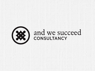
Importantly, she also requests the inclusion of a compass and jigsaw piece. You know, focus, direction, connectivity yada yada. Which sent shivers down my spine, so the challenge has been to create a visual link to said compass and jigsaw whilst avoiding the obvious clip art imagery.
Idea so far is to create a 4 cornered jigsaw bit, rotated 45 degrees, so that the corners then become the compass points, with a slight curve to these corners, the inner white bits are trying to re enforce the 'compass' aspect. As usual with me, trying to say 'more' with 'less' so bare minimums to make the visual associations work.
The people she will be reaching are health care professionals and such like, opposed to general public. Her competition in respects of branding is VERY VERY poor. So game on to create a unique brand mark, as much as I can from a compass and jigsaw piece.
This is concept stage, she likes the prelim ideas, so now I am tuning the logomark and looking at font choices. Suggestions welcome. :)
The end
