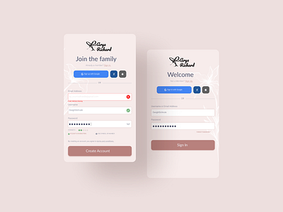
Sign up and Sign In page #DailyUI001
Thank you so much @vlockn for the invite. ^_^
For this design, I went through NNN Group articles and articles to know the best practices for the sign up page.
Sign Up page
Feedback were shown to let the user know if their username is available through the tick icon. For the passwords, constraints that were met changed it's color to the accent color and which weren't given a grey color which is used often used when components are disabled.
Missing fields stood with red color and message at the bottom.
Signing up using Google, Facebook or Apple ID reduces the friction of going through email confirmation and the need to set up another account and remember them.
More by Ritty Thomas View profile
Like
