Design Thumb
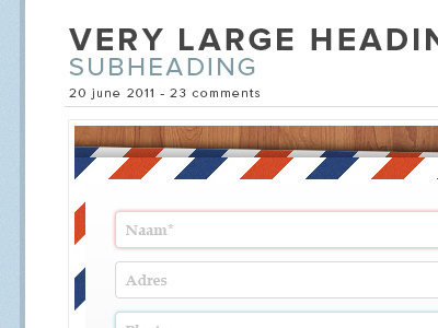
I may or may not be currently redesigning my website (Can you ever stick with a design for more than 6 months? I can't, drives me nuts!). Font used is the lovely Proxima nova. I'm not sure about the post date/comments line. I feel I could do much more with that, but have yet to find something I'd be happy with. Any ideas on that?
As of yet, I've only designed a single post page, which is also still heavily in progress (preview: http://cl.ly/0y2Q183L392i120Q1A0m). I'm going to incorporate ornate thingamajigs and doodads as content dividers, rather than the star that i'm currently using.
What are your thoughts so far? Should I stick with this of ditch this design all together?
More by Dennis Flinsenberg View profile
Like
