Facebook Redesign Exercise

Before the break each Handsome designer had an internal exercise to copy an existing UI pixel for pixel. The following week we were challenged to do a User Experience overhaul on an unrelated app by using the UI style we had just mimicked.
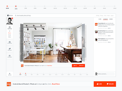
I copied the UI from The Next Web and overhauled the Facebook Feed Page.
My goals were to bring the focus back on content by minimizing the amount of onscreen elements.
I also am introducing the idea of a "dislike button" which helps Facebook learn from your preferences in order to serve you the more relevant content higher up in your feed.
On the left bar you'll notice a customizable tool bar which allows you to filter by the content you want to see most.
There are a lot more half-baked ideas scattered throughout the UI, but in general would love to hear if this new user experience is something you'd be more interested in than Facebook's current desktop experience?
Would love to hear everyone's thoughts and make sure to check out the attachment
