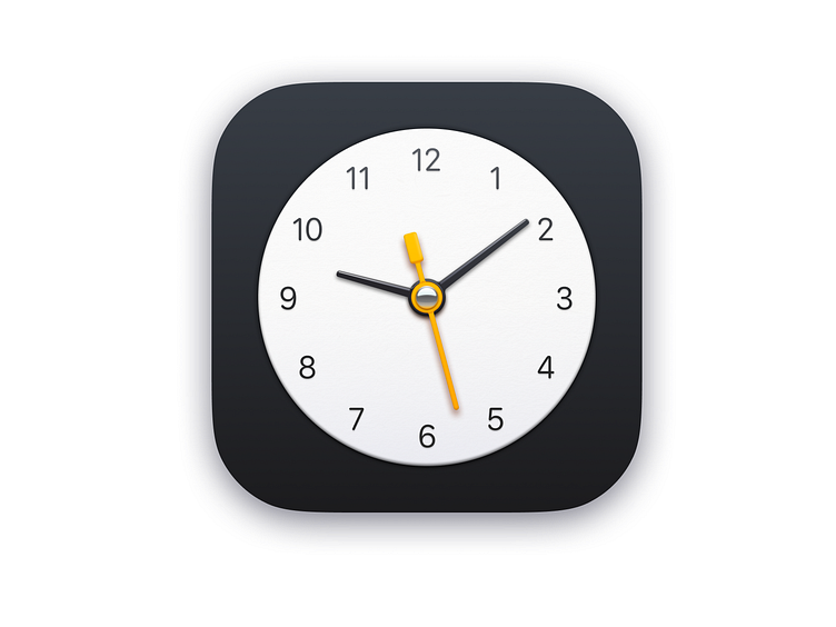
Clock
https://www.figma.com/file/9fdPp6NlAGhDHkuE5K62lq/clock?node-id=0%3A1
Trying out Figma for the first time. I'd previously been doing all my icons in photoshop. For a first icon, I think this came out OK.
I know I'm a bit late to this one, and I'm sure a ton of people have already written about Figma vs photoshop, but here are some thoughts I have for icon design specifically:
-- Vectors: I'd honestly give a slight edge to Figma. The way the paint bucket works is really different from photoshop/illustrator and honestly a lot more usable. It reminds me a bit of 3D software. The one thing it's missing is better transform tools, but I'm sure there are plugins for this. There's nothing I can do in Figma that I can't do in photoshop, but it's generally easier in Figma (and that's as a new user, too). -- Rasters: Photoshop has a ton of raster editing tools, Figma has none. A lot of people might say icons should be all vectors, but I personally like to approach icon design as closer to illustration. I often to sketch out my icons with the paintbrush first, and I use brushes to add texture and little details. It's a much more freeform workflow compared to doing it all in vectors. -- Other: How does Figma not have hue/saturation or levels? I downloaded a plugin for this but it's still got nothing on photoshop. I never get the right colors off the bat, so this is pretty essential IMO. Something like smart filters would be cool too. -- Overall: Figma feels more modern and is much easier to pick up, and I honestly want it to beat photoshop. But there's a few really critical "illustration" features it doesn't have yet. I realize Figma is a more web-design focused app, but with everyone cominging back to skeuomorphism now, I hope they'll make a place for icon design too.
