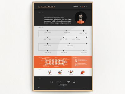
Infographic Resume
What are your thoughts of my infographic resume layout design?
I get a lot of people contacting me to created them individual infographic resumes, so this time I wanted to try another idea, another layout style. I was in the middle of creating a web design for a client when it hit me that I could design a resume like the landing page of a website. If you take a closer look, it looks just like a landing page, with the headline, imagery, sub-head, etc.
So, what are you thought about it? What is your honest thought about it? What would you have done differently?
The AI. File is downloadable for free until the end of the month, so feel free to get your copy if you like.
Best to you all,
Jack
Download link:
https://drive.google.com/file/d/1mwlMU7qB7zTKK_mYDIyfmg7xgrX8-jfW/view?usp=sharing
