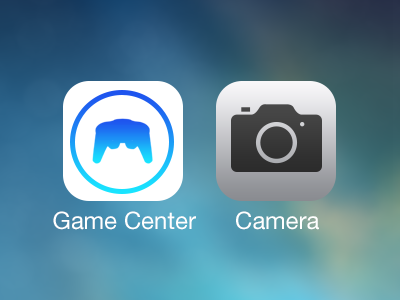
iOS 7 Icon Redesign (Game Center and Camera)
Well that's my quick redesign of the Game Center and Camera icon.
The current camera app icon isn't really flat. I like the icon from the Control Center much more, without any shadows etc. And I think we all know that the Game Center icon is terrible. I have no idea how Jony Ive and his team have created this ballons or whatever they are and how the user should know that this application is about gaming... Well.. these are my icons.
Feedback is welcome!
More by Christian View profile
Like
