DailyUI #031 - File Upload
Hey Dribbblers 👋
This is my #031 #DailyUI design.
Design Hint 💻 - Design a file upload element. Is it the loading screen and icon? A progress element? Are folders being uploaded by flying across the screen like Ghostbusters?
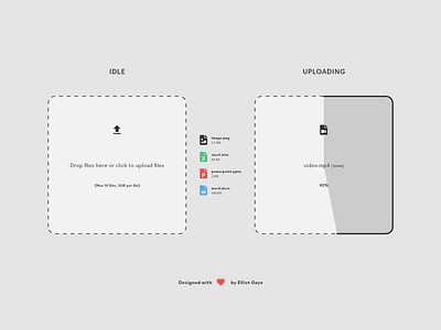
The Idea 💡 - The idea for today’s UI design is a simple file upload element for a potential cloud uploading service, file sharing service or something of the kind. The elements will feature a flat design with a dynamic colour palette depending on the file type that is being uploaded. This DailyUI is an experiment.
Final Thoughts 🧠 - I like my experiment idea. I think giving the user a visual progression element (right) helps understand the point at which the user is at through the uploading process, and designing that progression natively within the actual upload box (like I have done) is a neat and accessible way of doing so. Along with the actual percentage progression element, the user should be able to understand exactly where the upload process is at. The files in the centre of the design are representations of what a file that has been uploaded within a session would look like. Some file types like pptx, xlsx and docx would have a colour associated with the software that specific file type was from, with the more generic file types like png and mp4 being a standard dark Grey colour to fit in with the overall design of the other elements. The "progression box" mentioned earlier (right) would have a dynamic colour linked to it depending on the file type colour, too (in the design displayed to the right, its a Grey colour because of the mp4 file type). Overall, I think my experiment has gone quite well and its got a fair bit of functionality embedded within the simple design, I like what I've designed.
Share the love, press "L" if you ❤️ my work!
As always, I welcome any feedback! 😄
- Elliot
