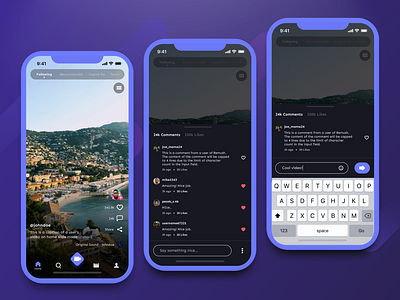
Remush Comment UI
The next big feature we worked on for Remush is the Comment section flow. This provides a way for viewers to show how they reacted towards a creator's content. We made the ability to comment feel seamless, by employing a bottom sheet to not disrupt the view of the user.
Speaking about comments, don't hesitate to leave a comment on how you feel about our design!
Or, if you need help on building a mobile app, feel free to reach out to us at info@flolab.co
More by Flolab View profile
Like
