Man vs Clock
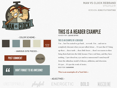
Rebrand of Man vs Clock. Client wanted something bold and for readers to either love it or hate it. Will likely change the typography though.
Site is in development, but you can check the current site out here: http://www.manvsclock.com
More by Quinn Zeda ✈ View profile
Like
