v3
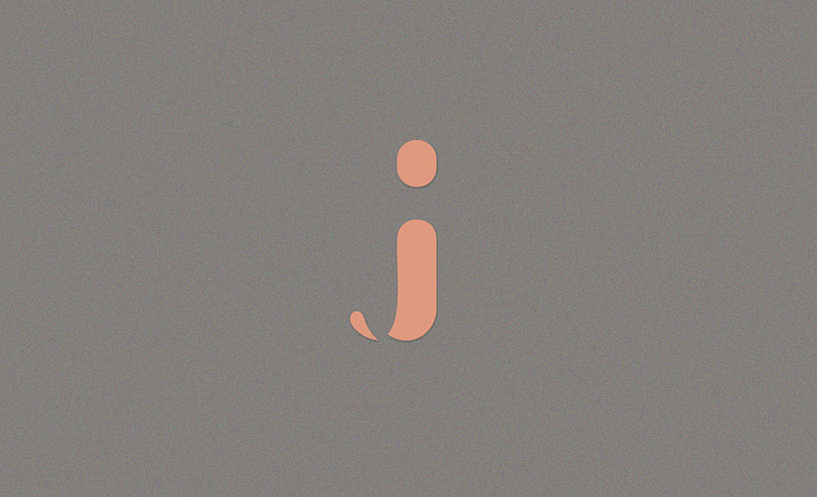
Dra. Juliana Salgado is a dermatologist. Search in your brand professionalism, experience, quality and dermatology taken seriously. The main concept of creating the logo was a union of the letter “J”, initial of the name of Dra Juliana, with the hair follicle, creating a unique and exclusive identity. The result of the creation was an easy to understand logo and memorize, facilitating understanding by private patients of the clinic, generating more confidence and credibility for the logo and consequently for a professional. The use of colors in the brand refers to the urban, modern, competent, self-confident, through gray. The orange tone seeks to refer to skin tone.
To see more work click here 👇🏻👇🏻 http://pribellafronte.com.br/
