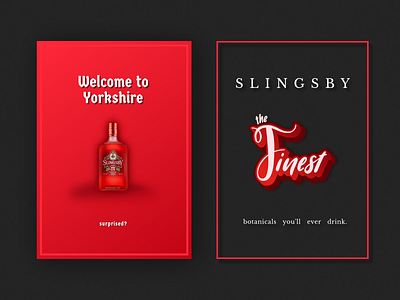
Slinsby Gin Ads - Unofficial
Simple advertising is what I like to have fun with, little quirks or rib pokes and pause moments like my first portfolio shots. Two variations of Slingsby Rhubarb gin, with trying out typography for matching the idea to the typography and not the words themselves; as "finest" for instance might spark an implication of luxury and class with minimal font but my representation of finest is meant to be fun, fruity and natural.
I did spend a while on varying font designs on complete ad sentences of varying meaning but stripped it back to its core once the message was getting lost. Sometimes you need to step away.
I need to say that the bottle I got from the virgin wines site, since the Slingsby site had lifestyle shots only. The "Finest" font is two separate fonts mixed but the design idea for the double drop down I found inspiration for that on Behance.
