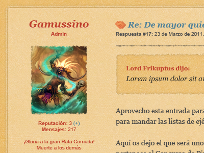
Miserables #3
Early stuff from a redesign for a friends' forum. Still testing lots of stuff like background textures (wefunction recent grunge 3 pack was used here ^^), fonts, etc.
I want to give it a mix of clean and torn apart feeling and so far i like how it's turning out.
To make it clean and easy to look at im trying to stick to as few colors as possible: outer background dark green, yellow for inside background, dark grey for text, blue for links and red for headlines, metadata and icons. Only links in actual posts content are underlined.
I'm not happy with the horizontal rule, though, i'll give it another try later on...
As always, any feedback is greatly appreciated. :)
PS: Avatar is just example, it's a character from Diablo 3 game, property of Blizzard entertainment.
