The big picture
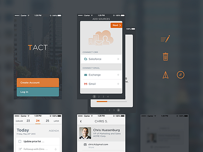

Art direction and visual design across TACT.
Big bold colors are reserved for moments when the user is creating content (taking notes, logging a meeting, etc), where as lighter colors are used elsewhere to optimize for reading content.
Light weight fonts and hairline strokes bring the look & feel up to date with iOS 7, while typeface choices and oversized buttons ensure the app retains it's own character.
Let me know what you think. Don't forget to view the attachment.