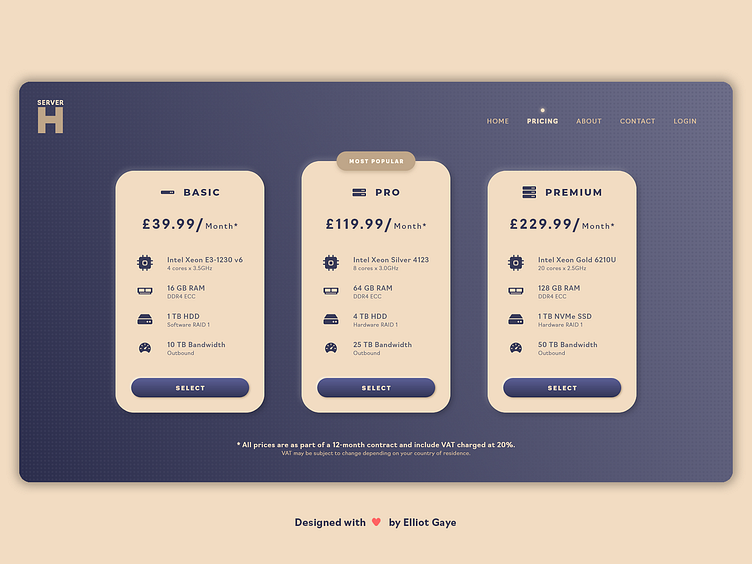
DailyUI #030 - Pricing
Hola Dribbblers 👋
This is my #030 #DailyUI design.
Design Hint 💻 - Design something related to pricing. Is it a pricing table? A restaurant menu with pricing?
The Idea 💡 - The idea for today’s UI design is a web-based pricing table page for a theoretical server hosting website, Server Host. The design will encompass iconography, a royal colour palette and various trends such as neurmorphism and others.
Final Thoughts 🧠 - It's a pricing table; it's moderately informational and detailed and it gets the product across to the end user, in a unique stylised and useable manner. The colour palette was one of the main design decisions that had been iterated upon a fair bit through designing, it was originally Greyscale (Black and White), then it changed to a Purple and Turquoise (to fit the server aesthetic) and finally changed to the Purple and Gold (keeping some of the server aesthetic, while looking more "premium") palette it is now. The "card" design of the pricing table feels intuitive, along with the iconography, it is extremely easy to understand and use. The rest of the overall page design feels minimal and simple which is nice since it lives in harmony with the focused table elements and the "dotted illusion" background gives the page a unique and attractive look. Overall, its a simple pricing table page that focuses on the pricing at hand, and I think the design and layout looks fine for a page of this nature.
Share the love, press "L" if you ❤️ my work!
As always, I welcome any feedback! 😄
- Elliot
