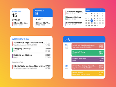
Daily UI 38 - Calendar Widgets
For this #dailyUI38 challenge, I decided to take inspiration from the iOS14 widgets and design a calendar widgets using Google Calendar as inspiration as that's the calendar I use.
The biggest change was adding small things, like an "Up Next" label to communicate clearly to the user, or the left and right chevrons to flick between different months on the widget. As well as glanceable information, they should provide a level of interaction for the users.
Designed using Figma
More by Christopher Haines View profile
Like
