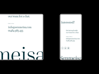
Senmeisa website design mobile and desktop footer
Fin. Final slide of Senmeisa. For the bottom footer we wanted to emphasis some of the design ideas we had practised earlier in the page.
In this case it was the huge typography we had used across the site. To keep the contact info legible we decided to apply the huge typography treatment to the logo itself.
More by James Betts View profile
Like
