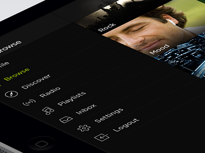
Spotify iOS7 - Browse
After making a lot of redesigns for the iPhone i decided to begin making a few for iPad, as the Spotify redesign was my latest i started with that.
The iPad as we know has a lot more real estate to play with and its important that the same features are available on both devices. With this in mind i kept the menu as is but made it static so the user can navigate at any time.
The search is also available from any screen similar to the iPhone version. The mini player at the bottom expands into a larger player within the menu (shot to be attached) also similar to the iPhone version.
as always real pixels are attached for your pixel viewing needs.
EDIT
The mini-player shot has been added :)
More by Michael Shanks View profile
Like

