Sign-In Dialog Take Two
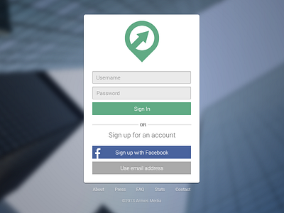
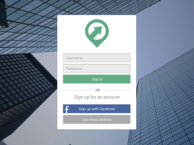
Take two! Blurred the background with a 7px gaussian blur, added in some footer links and a copy-right, and converted the icon to a vector to reduce the blurry edges after scaling it down.
All and all I think it's a bit better. This version will be viewed on desktops and tablets, the mobile responsive version will have larger, more finger-accommodating input fields for people with thumbs that don't like small screens (like myself).
More by Andrew Schmelyun View profile
Like

