Octocall Appointment Scheduler
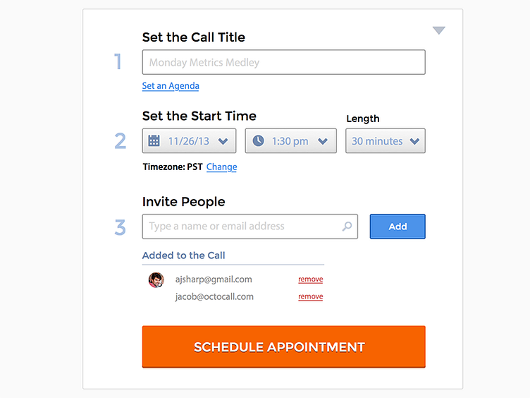
New design for the Octocall appointment scheduler. I re-organized some of the elements, and de-emphasized others in an attempt to make the form more consumable and less overwhelming.
I attempted to make the date and time selectors easier to recognize on a quick scan with some icons and placeholder values (which are the defaults if not set by the user). The date, time and length inputs are now select boxes (with optional search autocomplete when you click into one) as opposed to text input that expand to selects.
Hiding the agenda field also makes this form a lot less intimidating (don't make me write something!), and is in line with what we're seeing from usage -- about 50% of appointments do not have an agenda set.
Looking forward to any feedback :)
