Instagram Redesign
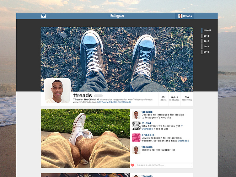
The other night I was looking at instagram's website and its user's profile layout. I decide to test my skill and take a shot at redesigning the site. I introduced it to a flat design. The design is simliar to facebook but still has the instagram feel. Dont forget to click @2x :)
*Features added or deleted
Added - Instagram Direct (top left on navbar) - timeline so users have quick access to their photos in order base on year - verified icon, that can be found on the mobile app - photos of @Maykel Loomans and @dribbble as example comments - flat ui colors - love for the product
Deleted - I decided to get rid of the grid of photos that were present. So that user has control on what photo is displayed in the spotlight. - The home button that is usually found on the top left is now gone. Usually you can redirect yourself to a homepage of a site by clicking the logo. - Edit profile is hidden under the main profile pic.
