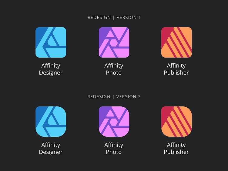
Logo Concept - Affinity Icons
Hii ^^ A few weeks ago I decided to checkout Affinity Designer, and damn I'm impressed! While having issue after issue with Adobe, this might become my new main software to create vector graphics. Anyway that's just my opinion so far.
The thing that kinda does not impress me are their icons. They're not too bad, just wanted to see if I could improve them. And meanwhile I could test the software a bit, get used to the workflow etc.
I have 2 versions. First version is the basic app-shape, second has a differend radius on the top right and bottom corners. Mostly to make it unique and fresh. Compared to the original designs, it was important for me to keep the shapes recognizable, even as small icons. This includes the lines, which I made quite a bit bigger. The second biggest change are the rounded corners on every element.
I couldn't find a briefing or story behind the icons, so my changes are based on their goofy tool-icons and what seemed more pleasing to the eye for me.
Lemme know what you think :D
