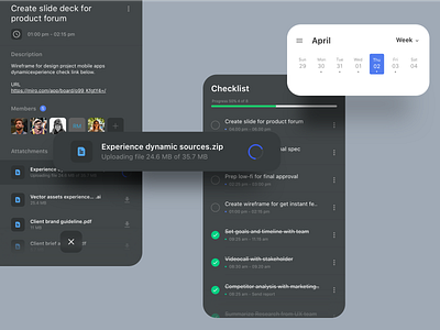
Heuristic Rule 01 - Checklist Apps
Hello designer folks! I try to share my knowledge about UI design guidelines from Nielsen and Molich’s 10 general principles for interaction design. They are called "heuristics" 🚩 Rule number 1
"Visibility of system status"
------------------------------------------------
The system should always keep users informed about what is going on, through appropriate feedback within reasonable time.
All highlighted interfaces on this post is how this rule is implemented in interface design.
When conducting a Heuristic Evaluation on interface design that is intended to find usability problems at heuristic point 1, Visibility of system status.
I usually make a question like the following:
1. Is the user aware of their current position within the user journey?
2. Is the user notified about changes in their user journey?
3. Is the user aware of factors that can have a significant impact on their experience?
4. Is there any informative feedback from the system?
Feel free for leaving your comments, constructive feedback is welcome. 🙏
Don't forget to share some ♥️ with this design
Never end to practice, learn and explore.
uxmarker was founded with one mission mind: creating the best and most reliable user-centered design for our clients. Here in our HQ, we deal with a wide range of design avenues on every product platform. To ensure a satisfying product experience, our dedicated team generate data from curated user research methods and analyse them to find and fix various design obstacles. With our ingenious ideas and tested skill, we believe we can help make your products a pleasure to workwith.
We are available for projects, hit us up at hello@uxmarker.com
Instagram || Medium || Shop at UI8


