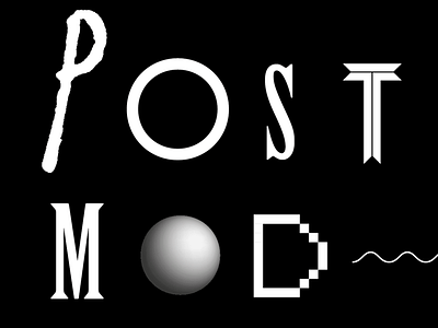
P Is For Postmodern
"squiggles, pixels, doodles, dingbats, ziggurats; boudoir colors: turquoise, peach, pea green, and lavender; corny woodcuts on moody browns and russets; Art Deco rip-offs, high gloss fi nishes, sleazy textures; tiny color photos surrounded by acres of white space; indecipherable, zany typography with miles of leading; text in all caps (despite indisputable proof that lowercase letters are more
readable); omnipresent, decorative letter spaced caps; visually annotated typography and revivalist caps and small caps; pseudo-Dada and Futurist collages; and whatever ‘special effects’ a computer makes possible. These inspirational decorations are, apparently, convenient stand-ins for real ideas and genuine skills."
— Paul Rand