Hacker News Refresh
My take on what hacker news could look like.
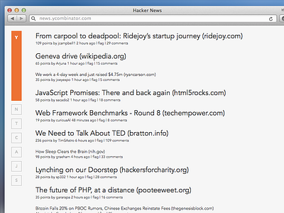
Notice the smaller font size on visited links. The smaller size and the aliasing gives the appearance of a lighter color when it's really the same throughout. Both the size and shade increase the speed at which the user can parse the site.
I kept the on-brand orange but shortened all the "everyday" links to single letters. The squares progressively get shorter until they are just a single letter (First visit, you'd see the whole word and after a few times either visited or clicking on the links they would automatically become the shortened, out of the way versions.)
Would love to hear any feedback