Website design for a photographer
Hello guys, it’s me Amr
Back to you today with a new website UI layout for a photographer that I personally admire his work and I found it a good exercise to use his amazing photos and a way to practice my skills as a UI designer, without a further to do let me explain to you the details of this website layout and how I came up eventually to that final design concept
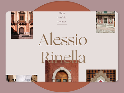
• Colors: Spicy mix, Mongoose, Bon jour and Mortar grey The reason why I decided to go with this color palette is the ability for them to give the exposure for one another, for me when working on a portfolio, breaking the rules are fun yes but you need to let the work of the designer or photographer, whoever you are creating the website for, considering that showing their work has to be the number one priority and that’s exactly the reason I didn’t like to go with dark colors and kept it just on the shore.
• Fonts: this time I decided to go only for 1 font and only stuck to it because it’s luxurious and it’s very playful, not modern but represents history and glamour at the same time “ Ogg Roman “ served this mission quite well in this design, a typeface designed by Sharp Type and inspired by the hand lettering of 20th century book designer and calligrapher Oscar Ogg.
• Structure: well, every time the placement of the menu frustrates me and for god sakes I felt like in all websites it’s always on the top left or it’s spread wide the top of the page and that looked super ugly specially with the minimal style I was trying to achieve, so! I decided that as long as we have only 3 main elements to use for the menu, why not to vertically align them, and that solved the visual problem for me, gave the photos “ the photographer’s work “ more room to breathe and feel at home. The pages, one continues page websites are the best from my point of view and honestly when I reached the About section as it’s not a page anymore, I felt like I have no space and no way to accomplish my idea of turning the whole website into 1 page, and that’s the reason why I added “ My story “ button to solve that problem and for visitors to be navigated to another page and read the whole story about the photographer. The Contact section which is the final one in our website is supposed to have a link as when you hover over the email written you can send an email immediately without needing to copy the email!
So, that’s it for today’s design guys, I hope you found it interesting to read the story behind this design and most importantly for me is to know your thoughts upon this design and whether you think something can be improved, feel free to text me and chat, I will be happy to do so :)
Stay safe and inspired 🙏🌙