C ya, letter! // Letter Illusions 14/15 - Logolounge 2020
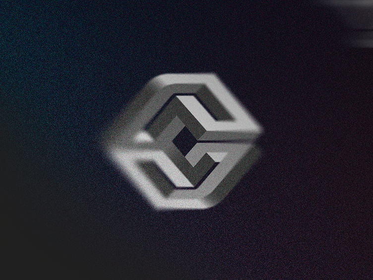
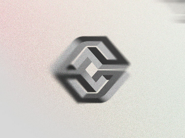
Trend Report // Logo Exercise ⠀ ⠀ This concept is very simple, just a C letter using the famous illusion of perspective present on Escher's works. I hope you like it and enjoy because we're almost in the end of this project! ⠀ Feel free for give me some feedback, does the concept feels nice? What do you people think? Would be nice to hear what you see on this symbol :)
This side-project is meant to be an exercise on the logo trends of the year. As I've said on the previous posts, my motivation is just to study the trends and hopefully create interesting concepts using it as platform, experience some new styles, etc. I hope you enjoy this project with me (feel free for check the 1, 2, 3, 4, 5, 6, 7, 8, 9, 10, 11, 12 and (uuuuuff) 13)! ⠀ Plus, I've decided to work on a fictional logo concept for each of the sections created for the Logolounge 2020 Trend Report. So I'm excited to try this new stuff and hope you people are enjoying this quick journey with me as well! ⠀ ⠀ Let me know what you think about this work, bro :) Your feedback is really highly appreciated! ⠀ ⠀ The description of the trend I'm following on this shot is above, I'd love to keep the discussion on this topic flow so here goes the text: ⠀ ⠀ "There are those things in life that can make us feel uncomfortable or on edge, but that captivate us nonetheless. It’s the old theory of a train wreck and not being able to look away. We may fain an objecting posture, but inside we want to take it in, secretly wishing we could stare at the scene like we’d paid full price at the freak show to watch the contortionist writhe. Feeding the public’s mind with the unexpected or seemingly impossible is not just a way of creating disruption; it’s also the way of communicating a promise, achieving the impossible or scouting a pathway to the unobtainable.
Virile strains of these marks have cropped up this cycle, with many using letterforms as a mnemonic reminder of the entities name. As if lifted from the pages of a book on optical illusions, these marks range from linear outlines like you’d find with DIY instructions, to the fully illustrated with gradients, shadows and spectral light pings. The use of graphic illusion is nothing new, but the abundance this year hints at a rediscovery of miraculous problem-solving skills and a unique perspective—or possibly the ability to teach your customers how to achieve the same. And when you can’t quite explain a client’s complicated process, laying claim to a little bit of magic is a great fall-back explanation" ⠀ ⠀ (article excerpt by Bill Gardner) ⠀