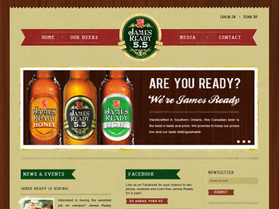
James Ready Beer Re-Design
A school project for re-designing a website of my choice. I chose the James Ready beer website (view their current site here). The user interface is terrible, the website displays little information about their actual beer, plus it's all made in Flash. I went with a organic feel, a little chaotic, but organized at the same time.
See the full sized image on Forrst.
More by Janna Hagan ⚡️ View profile
Like
