View options [Plentific]
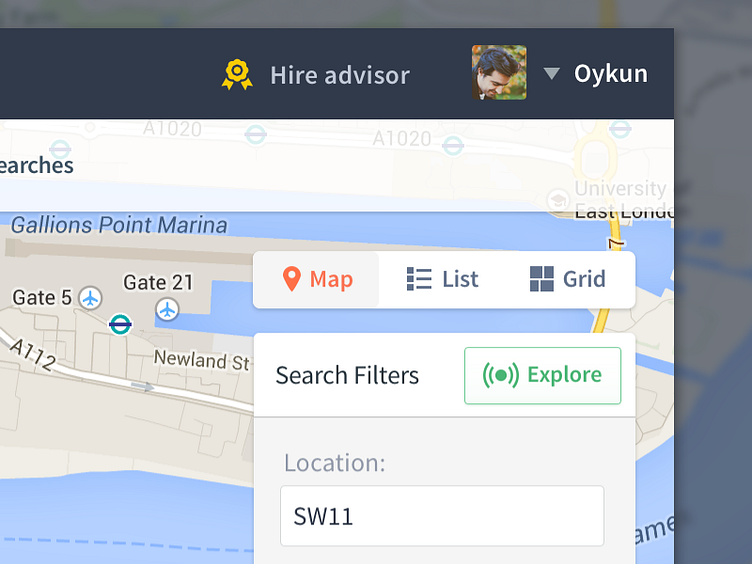
We have started a big UX/UI update to Plentific. Here is a work in progress screenshot for a new feature, View Options for search results...
Ps, we are bringing Explore feature which I will share more about it later. In here the button is active, that's why using green colour. We are also planing to animate the signals : )
You can like us on Facebook :)
More by Oykun Yilmaz View profile
Like
