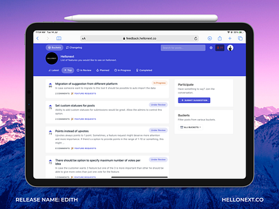
Customer feedback platform UI
We just pushed a new design for Hellonext.co (https://hellonext.co) — Customer feedback and feature voting tool. The UI had to be self-explanatory, minimal and fresh to look at.
We have also started naming our releases. The new release is called EDITH, inspired by the next Tony Stark’s virtual assistant.
Super excited about this release. Please tell us where we can improve this UI. So interested to know more from the Dribbble community.
More by Karthik Kamalakannan View profile
Like
