Pitchfork Redesign

Spent the evening playing around with a conceptual redesign of Pitchfork.
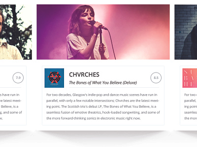
To be quite honest, I mostly just wanted to try playing with some more depth in my design after staying pretty flat for a while. I tried incorporating spotlight type shadows and a "card" design to try and change things up a little bit.
Before an onslaught of "THIS WILL NEVER WORK FOR PITCHFORK" comments, I understand. This is just a concept. In fact, it's just another exercise in learning and trying new things. I know there's no add space. I know there's no social media links. I know there is content missing and it's simply because I didn't want it there in this design and didn't feel it necessary to include.
Check out the real pixels for the real deal.