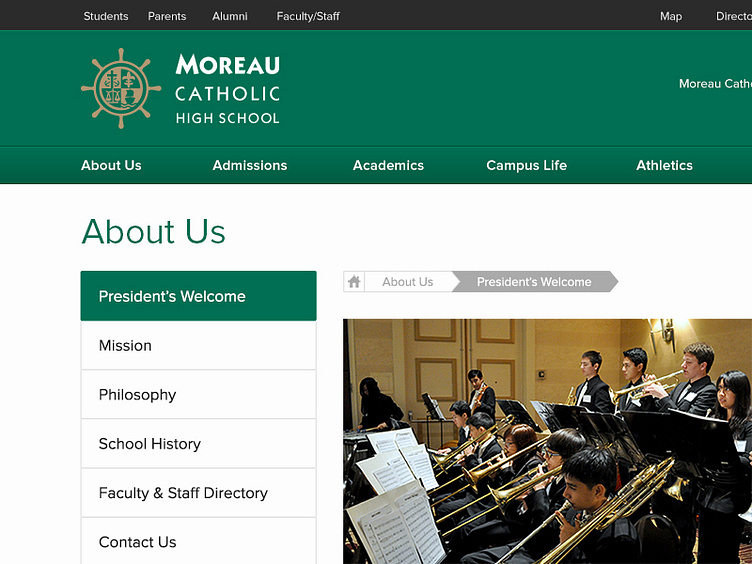
Moreau Redesign - Breadcrumbing
Child page on a school website that I am currently redesigning, with a huge respect to user experience. After a ton of research, the parents compared browsing school sites to online shopping. Some of these school sites accumulate over 2,000+ pages, so I really wanted to rework the navigation to act like a browsing compass. It's all about reducing bounce rates.
More by Cameron E Stewart View profile
Like
