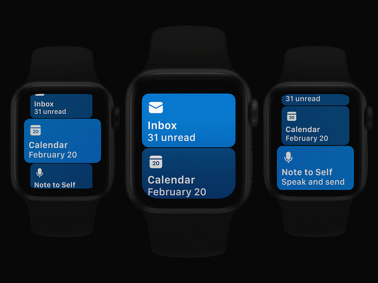
Outlook Apple Watch Main Screen Refresh
We’ve made some changes to your Apple Watch home screen to make it easier to switch between Inbox, Calendar, and Note to Self. We’re now adopting a card-based interface to create a more tactile and functional experience. Live icons also show what day it is, so you’re always in the know. Securely navigate between sections by swiping your finger or by turning the watch crown. Tap in and you’re exactly where you need to be.
The redesigned main screen is now live on the App Store!
-- A huge thanks to the team Ting Zhang and Nick Romano. The details make all the difference. 🤩
More by Microsoft Design View profile
Like
