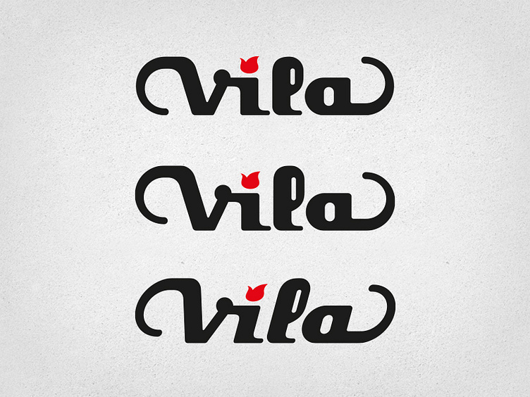
Vila Guitars Logo (more iterations)
Still more iterations. I changed the "a", as there was something I didn't like about the other. My brother asked for a version with a taller "V" and "l", and then to incline the logo (most guitar logos from the 1950s are slanted). Not yet the final version though, he doesn't quite like the "a" tail, so we'll need to find a solution to that.
More by Damian Vila View profile
Like

