Underrated Youth | Logo Design
Last time I shared a design for Underrated Youth's album cover, continuing the project now I created the logo.
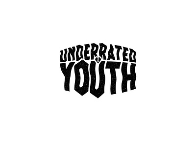
The text isn't completely geometrically acurrate, when I started working on it I felt, considering the name of the band, that the text should be a bit odd.
I associated youth, obviously, with - being rebellious, not necessarily following the rules.
How do you feel about this piece? :)