KACHE
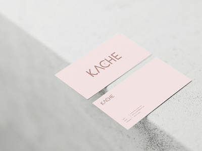
Branding for a new business selling artist made textural and printed pieces including woven wall hangings, silk scarfs and prints. The name kache derived from the French word ‘Cache’ which translates to ‘hidden’. The sparkles within the logo aimed to convey this meaning and to symbolise some sort of hidden treasure. The handmade pieces sold under the brand kache follow a muted colour scheme with an organic feel, which is why I chose to use a neutral pink and brown. The typical cliental of Kache is female between the age of 18-40 which is why it was important for the brand to retain a sense of femininity and youthfulness.
