Logo for community
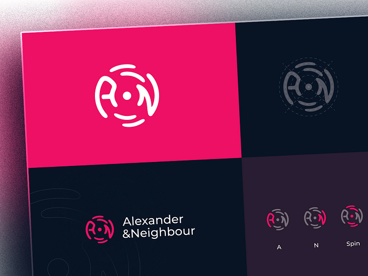
This mark was designed for a Neighbour community. The letters (A & N) and the other associated elements are spinning around a pivot point. That's the idea. Here I tried to visualize trust, togetherness and strength.
So now let's share what you are thinking about it. Looking forward to having your thoughts on my bucket. Chill ;)
For work enquaries, say hi at alivai.workshop@gmail.com Find me also on | Behance | Instagram
