Content Stream 2
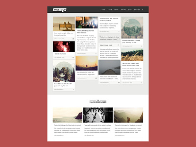
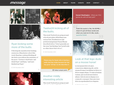
We pretty much went back to the drawing board with this one. We went a bit more minimal and smaller. Rather than trying to make all the blocks a little more interesting and colourful, while still matching each other, we realised that just keeping every minimal made it all work together better anyway. They match the single pages pretty well too which I might dribbble at some other point in the near or distant future.
Feedback welcome as usual! There's a big one attached. I also re-did the placeholder content, which we all know is the most important part.
(Also, there will come a footer someday).
More by Jonathan Ogden View profile
Like


