Golden Lucky Mandala // Twinkle 12/15 - Logolounge 202


Trend Report // Logo Exercise ⠀
⠀
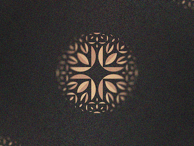
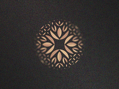
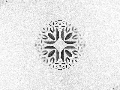
This trend is about sparkles, bright spots; stars, so I've made this lucky golden mandala and hope you like it! Shapes seem a bit like leaves, also a bit of a chinese luck biscuit (don't know the real name, but you know what I mean). I couldn't decide which orientation is better, so here goes both!
⠀
Feel free for give me some feedback, does the concept feels nice? What do you people think? Would be nice to hear what you see on this symbol :)
This side-project is meant to be an exercise on the logo trends of the year. As I've said on the previous posts, my motivation is just to study the trends and hopefully create interesting concepts using it as platform, experience some new styles, etc. I hope you enjoy this project with me (feel free for check the 1, 2, 3, 4, 5, 6, 7, 8, 9, 10 and (I'm almost losing it) 11)!
⠀
Plus, I've decided to work on a fictional logo concept for each of the sections created for the Logolounge 2020 Trend Report.
So I'm excited to try this new stuff and hope you people are enjoying this quick journey with me as well! ⠀
⠀
Let me know what you think about this work, my friend :)
Your feedback is really highly appreciated! ⠀
⠀
The description of the trend I'm following on this shot is above, I'd love to keep the discussion on this topic flow so here goes the text: ⠀
⠀
"Those that follow this report annually may recall a few years back we identified the expanded use of four-pointed stars to which we assigned the name Sparkle. At the time, this group was fledgling, but typically appeared as a non-aligned star avoiding jingoistic or religious connotations with more points. Four points was enough to get the idea across with minimal detail making it ideal for logo design. Much like many of the logos from those “Sparkle” stars were primarily used in a space-filler mode to add some magical charm to an illustrative mark with a capricious attitude.
We evolve and so do the trends. That planting of seeds a few years back not only sprouted a healthy set of legs this year, it’s grown into an Olympic sprinter. Leman Jewelry laid claim for the center stroke on their letter E, where every stone has that glint. This trend has pressed forward to the obvious, which is creating a star as the negative space at the convergence of four curves. For a client, this builds a good story of coming together to create a brilliant solution or a star from many. Remove any one of the pieces and the achievement vanishes." ⠀
⠀
(article excerpt by Bill Gardner) ⠀