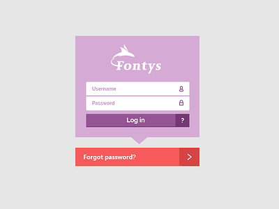
Fontys sign in
I was tired of the ugly sign in window on the university's web mail and portal site. Made it a bit more appealing (hopefully) and a lot easier. What do you think of the combined login and help button. The ? button gives some extra information about the account and will only be visible once clicked.
More by Florian Verrijk View profile
Like
