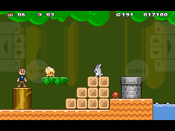
Mimeo iPad Controller
First pass at the controller overlay for the iPad version of Mimeo. Button positions are based on having your hands at rest on the center of either side of the device, the most comfortable position (in my limited testing), which places your thumbs about three quarters of the way up the screen.
The iPad screen dimensions afford 4x4pixel pixels leaving a single tiles height above and below the visible area of the iPhone/iPad touch and one column of tiles to the right. I've decided to display the extra column but leave black bars above and below. They disappear into the device chrome, make it more cinematic and will allow me to focus on creating levels that work based on a single vertical height without worrying about one device or the other feeling cramped or out of proportion.
I'll probably be rolling the new up/down and start button positions over to the iPhone/iPod touch version as well. Whatever controller layout I settle on the positions and distance relationships will be identical across devices in physical dimensions so you can leverage your muscle memory from one device to the other. The "start" button will probably end up with a different label (like "menu").
Download this sucker, scale it up 400% (nearest neighbor of course) and add to your iPad Photos for a hands on.
