Before and After - Modal Final Design
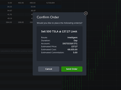
Here's the final design. See the attachment for the full pixels.
I've made a few UX changes.
- Checkmark and X icons removed for less clutter.
- Left Align Labels, Right Align Numbers so that it's easier to read
- Removed the color red for Cancel. I think it's confusing if you are opening a "Sell Order". I kept green for Send Order because green means "Go, Next, Make Money" .