Yahoo Redesign
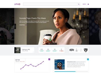

Tried my hand at another Yahoo redesign/simplification. This concept aims to simplify the clutter and bring the important content to the forefront.
I will concede that this is not likely the best route for Yahoo to go given their metrics and UX goals, but for me, and many people of my generation, this would be an interesting way to interact with Yahoo.
The cards that are being used can in theory be moved around, re-ordered, replaced with advertisements, etc. Also, the logo was found online from 99 designs and is NOT my own design.
Check out the full pixels attached!